Starting with the Basics: Oil Pastel Properties
A Brief Overview
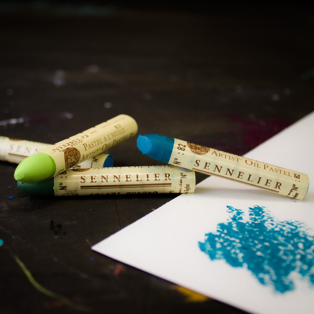
Oil pastels are a unique art medium, distinct in their rich color application and creamy texture. They blend well and offer artists immediate vibrant hues without needing extensive preparation or drying time. Ideal for beginners and seasoned artists alike, oil pastels are forgiving and versatile, suited for various art styles. Their simple composition of pigment, wax, and oil makes them an excellent choice for creating enduring oil pastel pictures.
Understanding Color and Texture
Working with oil pastels opens up a world of color richness and textural possibilities. The intense pigmentation ensures that even simple sketches pop with life. The texture, on the other hand, can range from smooth to rough depending on the application technique. By varying pressure, artists can create dynamic landscapes with depth. Tools like paper stumps and fingers can aid in blending to achieve soft gradients or sharp contrasts, crucial for capturing the nuances of natural scenes. Truly, understanding oil pastel properties is the first step in mastering the creation of captivating landscapes.
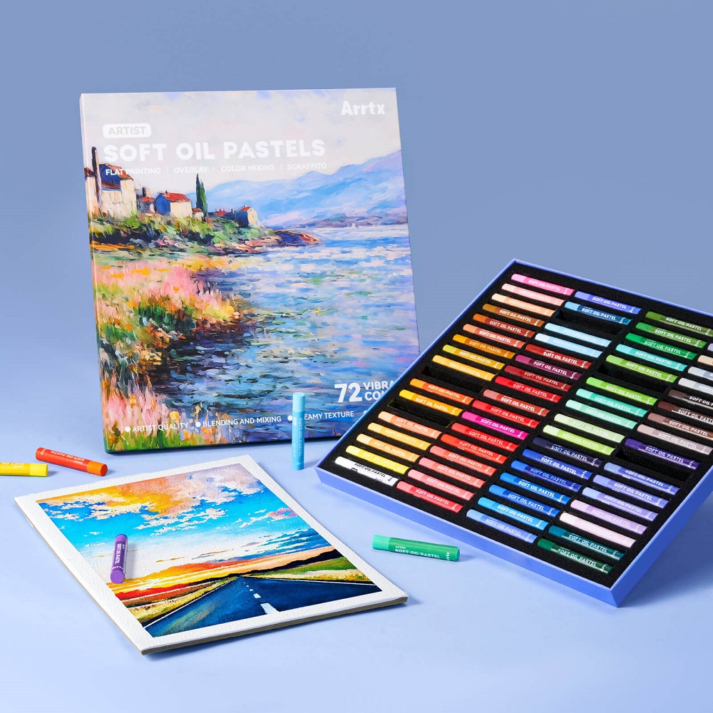
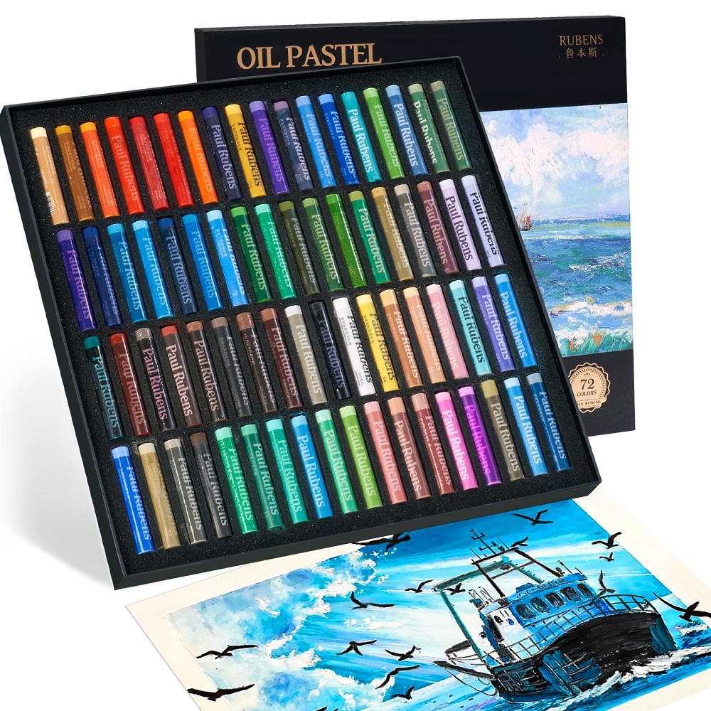
Essential Supplies for Oil Pastel Artwork
Best Paper Types for Oil Pastels
Choosing the right paper is crucial for oil pastel artwork. Heavyweight paper or cardstock is ideal, as it resists buckling under layers. Textured paper, like pastel paper, provides grip for the pastels. This helps in color layering. Watercolor paper also works well, especially with watersoluble oil pastels. It holds up to the water without warping. For a dramatic effect, black paper makes colors stand out. Finally, for a smooth finish, try hot pressed paper or even canvas.
Tools and Accessories to Enhance Your Work
To refine oil pastel pictures, certain tools and accessories are helpful. Paper stumps or blending stumps allow for fine blending. Your fingers can also blend colors, creating warm transitions. A palette knife can scrape off layers for texture adjustment. You might use fixatives to protect your work. They come in spray cans for easy application. Choose a low-odor type if you’re sensitive to smells. With watersoluble oil pastels, have a clean brush and water nearby. It’s for wash effects and blending. For precise work, have an eraser handy, preferably kneaded. It lifts the pastel without damaging the paper.
Step-by-Step Guide to Creating a Landscape
Sketching Your Scene
Start by choosing a simple and clear subject for your oil pastel picture. It might be a countryside hill or a tranquil beach. Begin with light pencil marks to outline the major elements. Capture the main shapes of the trees, hills, water, or buildings. Keep the sketch loose; the goal is not detail but placement. Your concept should guide color choices and texture application going forward.
Layering and Blending Techniques
With your basic sketch as a guide, start layering your oil pastels. Begin with light base colors for larger areas. Establish the sky, grass, and any other significant spaces. Use broad strokes for this step. Then, apply darker shades to build depth and form. Techniques such as cross-hatching can add texture. To blend, use your fingers or a blending stump. This step softens and combines layers for a natural look. For sharp details and highlights, add final touches of brighter colors or white. This method brings your oil pastel landscape to life with vibrancy and dimension.
Oil Pastel Tips for Atmospheric Effects
Creating atmospheric effects with oil pastels can transform a simple landscape into something magical. Capturing the right mood involves combining light, shadow, and color to simulate different times of day or weather conditions. Whether you’re aiming for the soft glow of dawn or the deep contrasts of a sunset, oil pastels offer the flexibility to create these effects with ease.
Capturing Light and Shadow
Start with understanding the direction of light in your scene. This guides where the highlights and shadows fall. Use lighter shades to represent areas hit by light, and darker tones for the shadows. Think of the sun’s position and how it affects the color temperature—warm hues for light, cooler shades for shadow. Gradually blend these tones to create the transition from light to dark, mimicking the natural diffusion of light in the environment.
Oil pastels can layer to convey the intensity of light. Add multiple layers of light pastels for a strong light source, or just a few strokes for a dimmer effect. Shadows shouldn’t be just black or grey. Add depth by including hints of the object’s original color.
Creating Water and Reflections
Water scenes in oil pastel pictures need special attention to detail. Light reflecting off the surface requires soft blending of whites and blues. For still water, use horizontal strokes to suggest calmness. Rippled water benefits from wavy lines and varied pressure to show movement.
When creating reflections, mirror the colors of the objects above the water. However, make the reflected colors slightly darker and blurrier than the actual objects. A light touch of white can represent the sparkle of sunlight. For a wet street look after rain, use oil pastels to layer and smudge colors, suggesting the reflective sheen on pavement.
By implementing these oil pastel techniques for atmospheric effects, artists can infuse their landscapes with a sense of realism and emotion that resonates with viewers. Whether portraying the delicate ripples on a pond or the bracing shadows beneath a mountain range, the right approach to light and reflections can elevate an oil pastel landscape from simple to stunning.
Composition and Perspective in Landscape Art
Creating stunning oil pastel pictures requires more than just skillful blending and color selection. Composition and perspective are vital in breathing life into landscape art. They help to structure your piece and guide the viewer’s eye through the scene, making your artwork feel more alive and realistic. With the right balance of foreground, middleground, and background, plus an understanding of perspective, your landscapes can attain a new dimension of depth and interest.
The Importance of Foreground, Middleground, and Background
In any landscape artwork, the foreground is what appears closest to the viewer. This area should have clear details and vibrant colors to grab attention. The middleground serves as the transition space, which often holds the main subject of your piece. It bridges the foreground and the background, which is the furthest zone and usually depicted with softer, more muted colors to create a sense of distance. By distinguishing these three zones, artists can create a more compelling piece that captures the essence of a real-life view.
Using Perspective to Create Depth
Perspective is the technique used to represent a three-dimensional world on a two-dimensional surface. Linear perspective uses lines that converge at the horizon to show depth. A simple rule is that objects get smaller as they get further away. Overlapping elements in your oil pastel pictures can also suggest depth, with objects in front blocking those behind. By carefully placing elements in your landscape, and considering the angle and viewpoint, you can create a believable space that invites viewers into your oil pastel world.
Thematic Landscapes: From Seasons to Time of Day
Transform your oil pastel pictures with themes that capture the essence of different seasons and times of day. From the fresh hues of spring to the golden touches of sunsets, each theme can set a distinct mood and atmosphere in your artwork.
Spring Meadows and Blossoming Trees
Capture the vitality of spring with vibrant green meadows and colorful blossoms. Use a variety of greens to reflect new growth. Add soft pinks, whites, and yellows for flowers. Illustrate the gentle warmth of spring light with soft gradients in the sky.
Sunsets and Glowing Horizons
Convey the drama of a sunset with intense oranges, reds, and purples. Blend these colors to create a glowing horizon. Include the fading blue of the daytime sky at the top for a realistic transition. Mimic the last rays of light with sharp, bright streaks.
Nightscapes and City Lights
Night scenes offer a chance to play with contrast and limited palettes. Use dark blues and blacks for the sky. Yellow, white, and neon hues can depict the bustling life and lights of a city. Reflect the city lights in water for added realism and detail.
Enhancing Landscapes with Watersoluble Oil Pastels
Watersoluble oil pastels bring a new dimension to traditional oil pastel pictures. They allow for wash effects, blending with water, and smooth transitions. With these pastels, artists achieve looks similar to watercolor paintings while maintaining the vivid colors oil pastels are known for. They’re perfect for capturing the fluidity of skies, water, and more atmospheric components in a landscape.
Creating Wash Effects
To start, lightly apply oil pastel on paper. Use a brush dipped in water to go over the pastel. This will spread the pastel like paint. This technique is ideal for skies or large bodies of water. It creates soft, translucent layers. Experiment with different amounts of water for varied results. Remember, less water means more intense color.
Combining Oil Pastels with Other Mediums
Try mixing oil pastels with other art mediums. Use pencil for initial sketches. Apply acrylic for textured backgrounds. Even watercolors can underpin your oil pastel work. The oil pastels can then add vibrant highlights and details. This mixed media approach adds richness and depth not possible with a single medium. The key is to play with textures and finishes to enhance your landscape’s visual appeal.
Inspiration from the Great Outdoors and Beyond
Bringing Travel Memories to Life
Travel can ignite a creative spark like nothing else. Capturing those moments in oil pastel pictures brings a part of the journey home. Start with photos from your trips. Look for colors and scenes that resonate. Sketch the outline of that beach sunset or mountain trail. Use oil pastels’ vivid hues to recreate the scene’s essence. Layer and blend the colors to reflect your memory’s mood. Remember, the goal is not a perfect replica but an artwork that evokes the joy and beauty of that place.
Translate the ruggedness of mountains with thick, bold strokes. For a beach scene, smooth blending can suggest the calmness of the sea. Greens and blues work well for natural landscapes, while urban scenes may call for grays, browns, and pops of color.
Urban Landscapes and Street Scenes
Cities offer a wealth of inspiration for oil pastel artwork. Their dynamic street scenes, with a mix of architecture and life, are exciting subjects. Look at the angles and textures of buildings. Consider the flow of people and vehicles. In oil pastel pictures, use straight, confident strokes for structures. Add life with small dashes of vibrant oil pastels for moving elements.
Street lights and signs add interest with their bright colors in a cityscape. Reflect these lights on windows and streets for a touch of realism. In your drawings, buildings can tower with the help of vertical strokes. Streets come alive with horizontal lines. The right combination of colors and strokes can turn a simple urban scene into an oil pastel masterpiece.