What is a Color Palette?
Definition and Overview
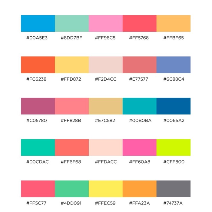
What is a color palette? A color palette is a collection of colors used in design projects. Designers create palettes to convey branding, mood, or style intentions. It includes specific hues, shades, tones, and tints. A carefully crafted palette helps maintain visual consistency and appeals to viewers.
Color palettes serve as a guide for choosing harmonious combinations. They prevent random color choices that might clash or confuse viewers. Common palette types include monochromatic, complementary, and analogous schemes.
Importance in Visual Design
Color palettes play a vital role in creating effective and appealing designs. They set the visual tone and establish a connection with the audience. By using a well-chosen palette, designers can enhance the aesthetics and clarity of their work.
A cohesive palette strengthens brand identity and message. It ensures the design aligns with the project’s goals and target audience. Additionally, using colors strategically can evoke emotions and influence perceptions. In design, choosing the right palette impacts both usability and visual appeal.
Types of Color Palettes
What is a color palette? Understanding different types of color palettes is key to successful design. They help you create visually appealing and purposeful projects. Let’s explore the major types of color palettes designers commonly use.
Monochromatic Color Schemes
Monochromatic palettes focus on a single hue. They include variations like shades, tints, and tones of that color. This approach creates a clean and cohesive look. It’s often used in minimalist designs to evoke simplicity and elegance. Monochromatic schemes are easy to balance and ensure visual harmony. However, to avoid monotony, contrast in brightness or saturation can add depth.
Complementary Color Palettes
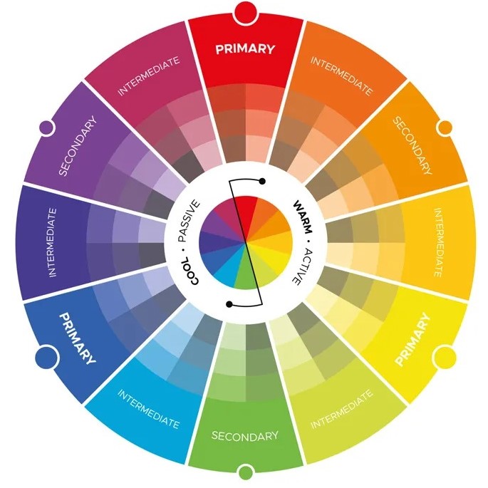
Complementary palettes combine colors opposite each other on the color wheel. For example, blue and orange or red and green. This scheme offers strong contrast and high visual energy. It’s great for grabbing attention and creating dynamic visuals. However, overuse can feel overwhelming. To balance it, use one color as dominant and the other as an accent.
Analogous Color Palettes
Analogous palettes use colors next to each other on the color wheel. For instance, yellow, orange, and red are analogous colors. These palettes produce a harmonious and serene effect. They are often seen in natural settings like autumn leaves or sunsets. Analogous schemes work well in designs that require a tranquil or cohesive feel. Use varying saturation levels to add more visual interest.
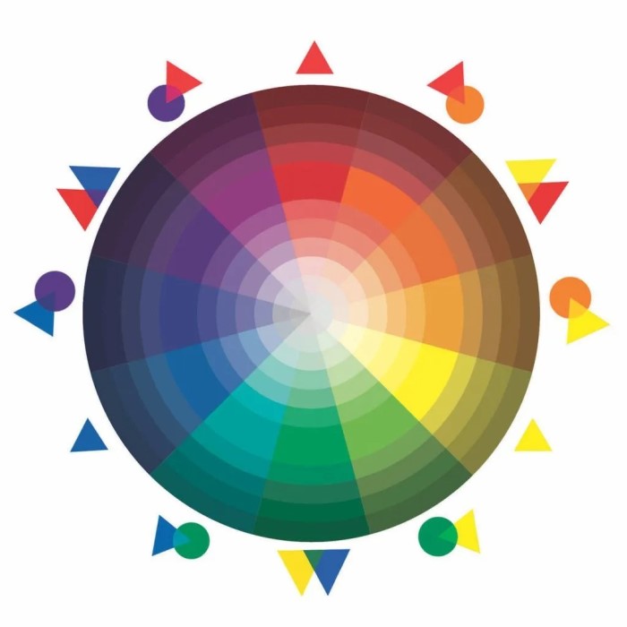
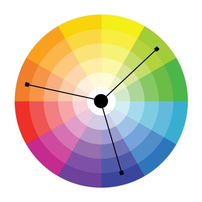
Triadic and Tetradic Palettes
Triadic palettes involve three evenly spaced colors on the color wheel. For instance, red, blue, and yellow form a triadic scheme. These palettes are vibrant and balanced while offering plenty of contrast. Use one color dominantly and the other two for accents.
Tetradic palettes, also known as double complementary palettes, include four colors. These are two complementary pairs. For example, blue and orange paired with yellow and purple. Tetradic schemes are rich and versatile but can be challenging to balance. To use them effectively, focus more on one pair and use the others sparingly.
How to Choose a Color Palette for Your Project
What is a color palette? Choosing the right color palette is essential for creating appealing and effective designs. A thoughtful selection ensures that your design resonates with the audience and aligns with your goals.
Factors to Consider
- Purpose and Message: Define the goals of your design. Understand the message you want to convey.
- Target Audience: Consider the demographics, preferences, and emotions of your audience.
- Brand Identity: Ensure the colors reflect your brand tone and personality.
- Environment: Match the colors to the context where the design will appear, such as websites or print.
- Contrast and Readability: Choose colors that provide strong contrast for text readability and visual clarity.
- Color Psychology: Understand how colors affect emotions and behaviors. Use them to create the desired mood.
- Versatility: Ensure the palette works across multiple formats and styles, from digital to print media.
Tools and Resources for Color Selection
- Adobe Color: Explore harmony strategies and create professional custom palettes.
- Canva Color Palette Generator: Generate palettes based on images or suggested themes.
- Coolors: Quickly browse, generate, and save palettes with an easy-to-use interface.
- Color Wheel Tools: Utilize traditional color wheels to understand color relationships.
- Design Inspiration Websites: Platforms like Behance and Dribbble showcase trending palettes and ideas.
- Mobile Apps: Use apps like Paletton or Pigment for on-the-go palette creation.
By using these tools and considering these factors, designers can create palettes that elevate their projects and appeal to audiences.
Psychological Impact of Colors
Colors play a powerful role in influencing emotions and behaviors. Understanding their impact is essential for effective design. By leveraging color psychology, designers can elicit specific feelings and create lasting impressions.
Colors and Emotions
Each color triggers distinct emotional responses. Here are some common associations:
- Red: Evokes energy, passion, or urgency. It grabs attention and stimulates action.
- Blue: Promotes calmness, trust, and stability. It’s often used by financial and healthcare brands.
- Yellow: Reflects happiness, optimism, and warmth. Excessive use can lead to anxiety.
- Green: Represents nature, growth, and health. It conveys balance and harmony.
- Purple: Symbolizes luxury, creativity, or wisdom. It’s used for premium or spiritual branding.
- Black: Denotes authority, elegance, or sophistication. Overuse can feel overwhelming.
- White: Suggests simplicity, purity, and cleanliness. It’s widely used in minimalist designs.
Designers can intentionally combine colors to evoke complex emotions. For instance, red and yellow together stimulate appetite, making them popular in food logos.
Cultural Differences in Color Perception
Colors have varied meanings across cultures. Consider cultural context to avoid miscommunication:
- In Western cultures, white represents purity, but in some Asian cultures, it signifies mourning.
- Red symbolizes love or celebration in many areas but can imply danger in others.
- Yellow is associated with joy in the West but can mean jealousy in parts of Europe.
- Green reflects prosperity in the Middle East but might signify jealousy elsewhere.
- Black often connotes sophistication in fashion but represents tragedy in some societies.
By understanding these cultural nuances, designs can resonate better with diverse audiences. Tailoring palettes to align with cultural perspectives enhances global appeal.
Popular Tools for Creating Color Palettes
Designers use various tools to create effective and appealing color palettes. These tools simplify the process and ensure professional results. Below are some popular options to consider:
Adobe Color
Adobe Color is a versatile tool for creating custom palettes. It provides various harmony rules like complementary, analogous, and more. Users can extract palettes from images or experiment directly on the color wheel. The interface is user-friendly, making it ideal for both beginners and professionals. Adobe Color also integrates seamlessly with other Adobe Creative Cloud tools.
Canva Color Palette Generator
Canva’s Color Palette Generator is a simple and effective resource. You can upload an image, and the tool instantly generates a palette from it. This feature is excellent for extracting inspiration from nature, art, or photos. Canva’s platform is beginner-friendly and offers a wealth of design tools alongside the palette generator.
Coolors and Other Platforms
Coolors is a fast and intuitive platform for generating palettes. With just a click, users can create, explore, and save custom schemes. It also lets you adjust hues, saturation, and brightness for precision. Coolors has additional features like exporting palettes and creating gradient designs.
Other useful platforms include tools like Paletton and Colormind. They offer similar functionality and allow for easy exploration of harmonious combinations. These resources ensure that even novice designers can create professional and appealing color palettes.
Tips for Using Color Palettes Effectively in Design
Color palettes are powerful tools that can make or break a design. Proper use ensures your design looks professional, feels cohesive, and resonates with your audience. Below are key tips to master color palettes in your projects.
Maintaining Consistency
Consistency is crucial for creating recognizable and professional designs. Follow these tips to maintain it:
- Stick to Your Chosen Palette: Avoid introducing random colors. Use only the colors set in your palette.
- Align with Brand Identity: Reflect your brand’s style and personality in the palette.
- Establish a Hierarchy: Assign specific roles to your colors, such as primary, secondary, and accents.
- Use Design Systems: Leverage tools like style guides or design frameworks to ensure consistency across projects.
By sticking to these principles, your designs will feel more cohesive and balanced.
Balancing Contrast and Harmony
Creating balance means ensuring your design is both eye-catching and pleasant to view:
- High Contrast for Readability: Ensure sufficient contrast between text and background for easy readability.
- Smooth Transitions: Use gradients or complementary tones to keep transitions soft and harmonious.
- Use Dominance Carefully: Let one color dominate, with others supporting as accents.
- Avoid Overloading: Limit bright or saturated colors to prevent visual clutter.
Balancing contrast and harmony ensures your message is clear and visually appealing.
Accessibility Considerations
Accessible designs ensure everyone, including those with visual impairments, can engage with your content. Keep these tips in mind:
- Test Contrast Ratios: Use tools to check that your text contrasts strongly against its background.
- Avoid Reliance on Color Alone: Use symbols or patterns to convey information alongside color.
- Consider Color Blindness: Choose shades distinguishable by those with common color vision deficiencies.
- Follow Standards: Refer to accessibility guidelines, such as WCAG, to make designs inclusive.
By prioritizing accessibility, your designs reach and impact a wider audience.
Effective use of color palettes in design ensures professional, appealing, and user-friendly results. Always prioritize consistency, balance, and inclusivity in your projects.
Examples of Successful Color Palettes in Design
Color palettes are integral to creating impactful designs across different domains. Here are examples where smart color choices greatly enhance the aesthetic and functionality.
Web Design
Web design relies heavily on cohesive color palettes to create engaging user experiences. For example:
- Minimalistic Sites: Monochromatic schemes with neutral tones build clean and sleek designs.
- E-commerce Platforms: Complementary colors like red and green emphasize deals and inspire purchasing behaviors.
- Corporate Websites: Blue tones convey trustworthiness and professionalism, appealing to their target audience.
- Creative Portfolios: Analogous schemes like yellow, orange, and red evoke warmth and artistic expression.
Using palettes strategically ensures that websites are visually appealing and easy to navigate.
Branding and Logos
Brands utilize color palettes to establish strong identities and emotional connections. Examples include:
- Luxury Brands: Purple, black, and gold create an air of sophistication and exclusivity.
- Health and Wellness: Green paired with earthy tones reflects nature, balance, and care.
- Technology Companies: Blues signify reliability and innovation, while accent colors like white or neon reflect modernity.
- Youthful Brands: Bright, triadic schemes provide a playful and energetic vibe.
Carefully chosen palettes ensure brands stand out and resonate with their audience.
Social Media Graphics
Social media graphics require striking visuals to capture attention quickly. Successful palette examples include:
Infographics
- High Contrast Schemes: Utilizing high contrast color schemes, such as orange and blue, can significantly enhance the clarity of infographics.
- Focus on Key Details: The stark difference between these colors draws the viewer’s attention to essential information, making it easier to digest complex data quickly.
- Visual Hierarchy: By strategically placing high-contrast colors in different sections, designers can create a visual hierarchy, guiding the audience on what information is most critical.
Event Announcements
- Warm Tones: Color choices like red and yellow are ideal for event announcements, as they evoke feelings of excitement and urgency.
- Psychological Impact: Red can stimulate a sense of action and energy, prompting viewers to take immediate notice. Meanwhile, yellow conveys warmth and optimism, encouraging attendance and participation.
- Call to Action: Using warm tones in event announcements helps create strong calls to action, motivating audiences to respond quickly and engage with the event being advertised.
Inspirational Quotes
- Soft, Pastel Shades: When designing for inspirational quotes, softer pastel shades can evoke feelings of calmness and positivity.
- Emotional Response: Pastel colors, such as light pinks and soft blues, often evoke serene emotions that enhance the overall message of inspiration and hope.
- Aesthetic Appeal: These colors create an inviting atmosphere that encourages viewers to reflect on the message being presented without feeling overwhelmed.
Promotions
- Vibrant Complementary Colors: For promotional materials, using vibrant complementary colors like purple and green can make advertisements pop.
- Attracting Attention: The striking contrast between purple and green captures attention more effectively than monochromatic schemes, making it easier for customers to notice promotions in crowded spaces.
- Brand Recognition: Implementing vibrant colors not only enhances visibility but also assists in branding efforts. When utilized consistently, these colors can become associated with specific products or campaigns, fostering brand recognition among consumers.
Effective palettes improve engagement and highlight important messages in social media designs.
Conclusion: Mastering Color Palettes in Design
In conclusion, understanding what is a color palette is essential for anyone involved in design, from beginners to seasoned professionals. Color palettes are not just about aesthetics; they play a fundamental role in communicating messages effectively and creating engaging visuals.
By leveraging color theory, selecting the right combinations, and using the myriad of tools available, you can craft stunning designs that resonate with your audience. As you embark on your design journey, remember that a well-thought-out color palette can elevate your work, ensuring it captures attention and conveys your intended message.
With this knowledge, you are now equipped to explore the world of color palettes and create designs that are not only beautiful but also impactful.